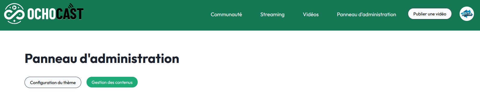
Admin Panel Guide
The OchoCast admin panel allows administrators to customize the application's appearance in real time without directly modifying the source code. This guide details each feature and its visual impact.
Accessing the Panel
Access URL: /admin
Only users with administrator privileges can access this panel. Non-admin users will be redirected to a 404 page.
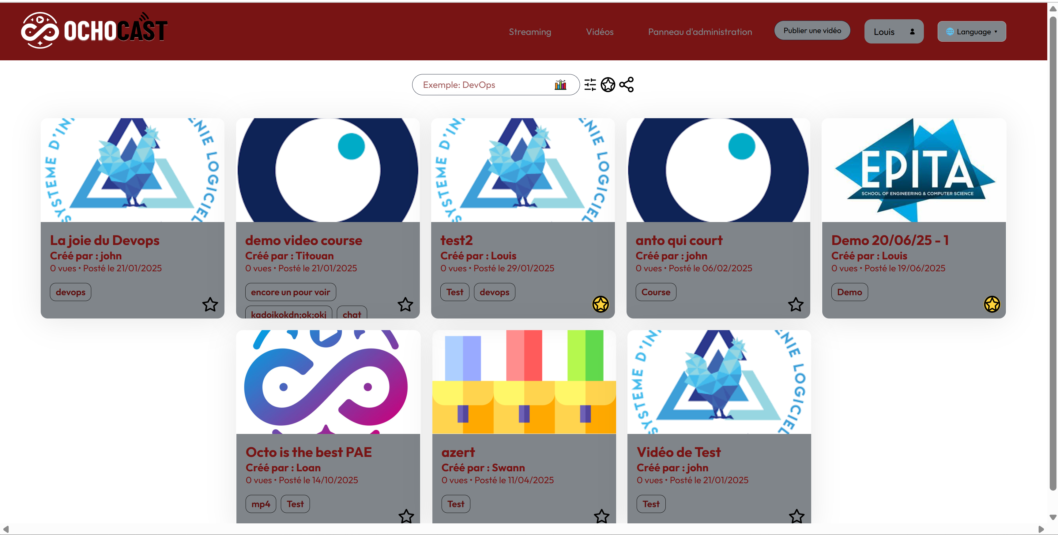
Overview
The admin panel is organized into several sections:
- General information – Application name
- Theme colors – Main color palette
- Color preview – Preview of generated gradients
- Branding images – Custom logos and icons
- Content management – Video archiving and administration (Go to)
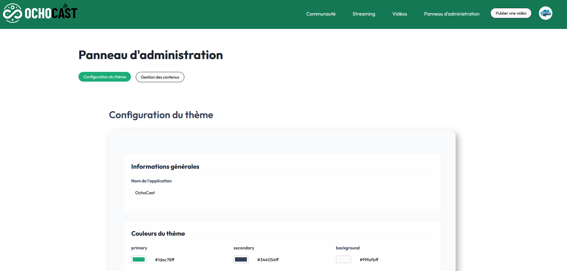
Full view of the admin panel with all sections
The Content management section (see link above) covers video archiving operations, as well as admin-only features: viewing archived videos, restoring them, and permanently deleting them.
This documentation is organized into two clearly separated parts: theme configuration (sections 1–4) and content management (video archiving and administration). Use these shortcuts to navigate quickly: Theme configuration · Content management
Quick start
- Log in as an administrator.
- Open the
/adminURL. - In General information, update
appNameif needed, then click Save configuration. - Adjust the colors in Theme colors.
- Upload images in Branding images, then save.
1. General information

Section used to change the application name
Application name
Field: Application Name / Nom de l'application
Description: This field defines the name displayed throughout the application.
Visible effect:
- Appears in the page title (browser tab)
- Displayed in the navigation bar
- Used in emails and notifications
Example:
appName: "OchoCast"
Where to see it:
- Top left of the navigation bar
- In the browser tab
- On the login page
Example of a logo displayed in the navigation bar
2. Theme colors
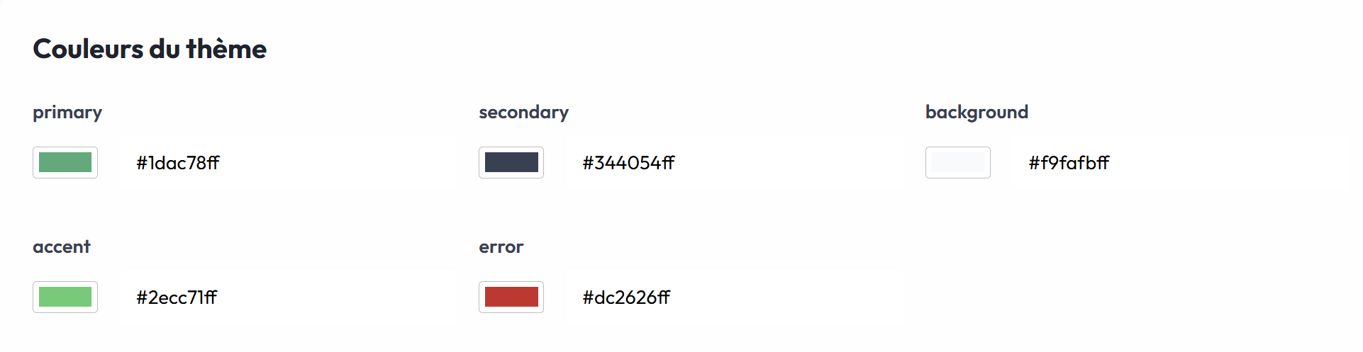
The 5 color fields with their pickers
The color system uses a hexadecimal format with transparency (8 characters: #RRGGBBAA).
2.1 Primary color
Field: primary
Description: The primary color of the application, used for interactive elements and key accents.
Visible effect:
- Primary buttons (login, save, confirm)
- Clickable links
- Active navigation elements
- Progress bars
- Important icons
Format: #1dac78ff (default green)
Usage examples:
- “Save configuration” button in the admin panel
- “Sign in” button on the authentication page
- Links in the navigation bar
Before/after changing colors:
Application with default colors
Application with new customized colors
How to change:
- Click the color selector (colored square)
- Choose a color in the picker
- OR type a hex code directly in the text field
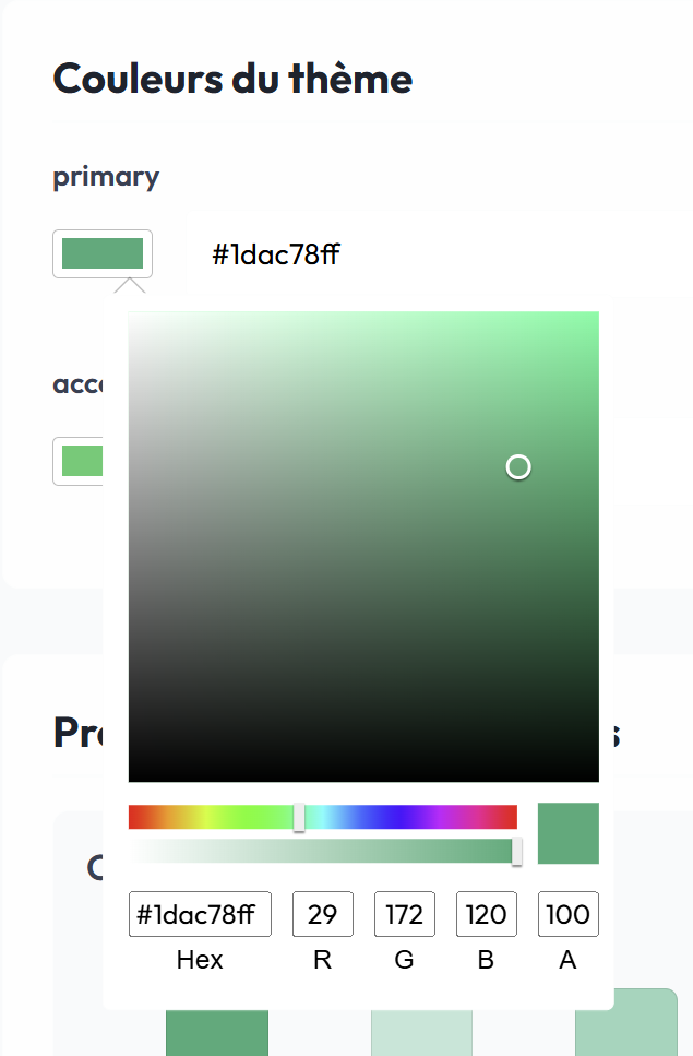
Color picker open to select a color
2.2 Secondary color
Field: secondary
Description: Color used for secondary text and borders.
Visible effect:
- Description text
- Card borders
- Separators
- Form text
Format: #344054ff (default dark gray)
Usage examples:
- Description text under headings
- Form field borders
- Divider lines between sections
2.3 Background color
Field: background
Description: Main background color of the application.
Visible effect:
- Background of all pages
- Section backgrounds
- Spacing between cards
Format: #f9fafbff (default very light gray)
Usage examples:
- Home page background
- Admin panel background
- Video lists background
2.4 Accent color
Field: accent
Description: Color used to draw attention to specific elements.
Visible effect:
- Notification badges
- Highlights
- Informational alerts
- Highlighted elements
Format: #2ecc71ff (default light green)
Usage examples:
- “New” badge on recent videos
- Success notifications
- Featured elements
2.5 Error color
Field: error
Description: Color used for error messages and critical alerts.
Visible effect:
- Error messages
- Invalid field borders
- Delete buttons
- Critical alerts
Format: #dc2626ff (default red)
Usage examples:
- “Error while saving” message
- Red border around an invalid field
- “Delete” button for dangerous actions
3. Color preview

Automatically generated color palettes (variants 50–900)
This section automatically displays the generated variants from the base colors.
3.1 Gradient system
For each base color, the system generates 10 variants (50, 100, 200, 300, 400, 500, 600, 700, 800, 900):
- 50–400: Light variants (mixed with white)
- 500: Exact base color
- 600–900: Dark variants (mixed with black)
3.2 Primary color preview
Section: Primary Color Preview
Display:
- Full palette of the 10 primary color variants
- Hex code for each variant
- Real-time visual preview
Generated CSS variables:
--theme-color-50
--theme-color-100
--theme-color-200
--theme-color-300
--theme-color-400
--theme-color-500  /* Base color */
--theme-color-600
--theme-color-700
--theme-color-800
--theme-color-900
3.3 Background color preview
Section: Background Color Preview
Display:
- Full palette of the 10 background color variants
- Hex code for each variant
- Real-time visual preview
Generated CSS variables:
--bg-color-50
--bg-color-100
--bg-color-200
--bg-color-300
--bg-color-400
--bg-color-500  /* Base color */
--bg-color-600
--bg-color-700
--bg-color-800
--bg-color-900
4. Branding images
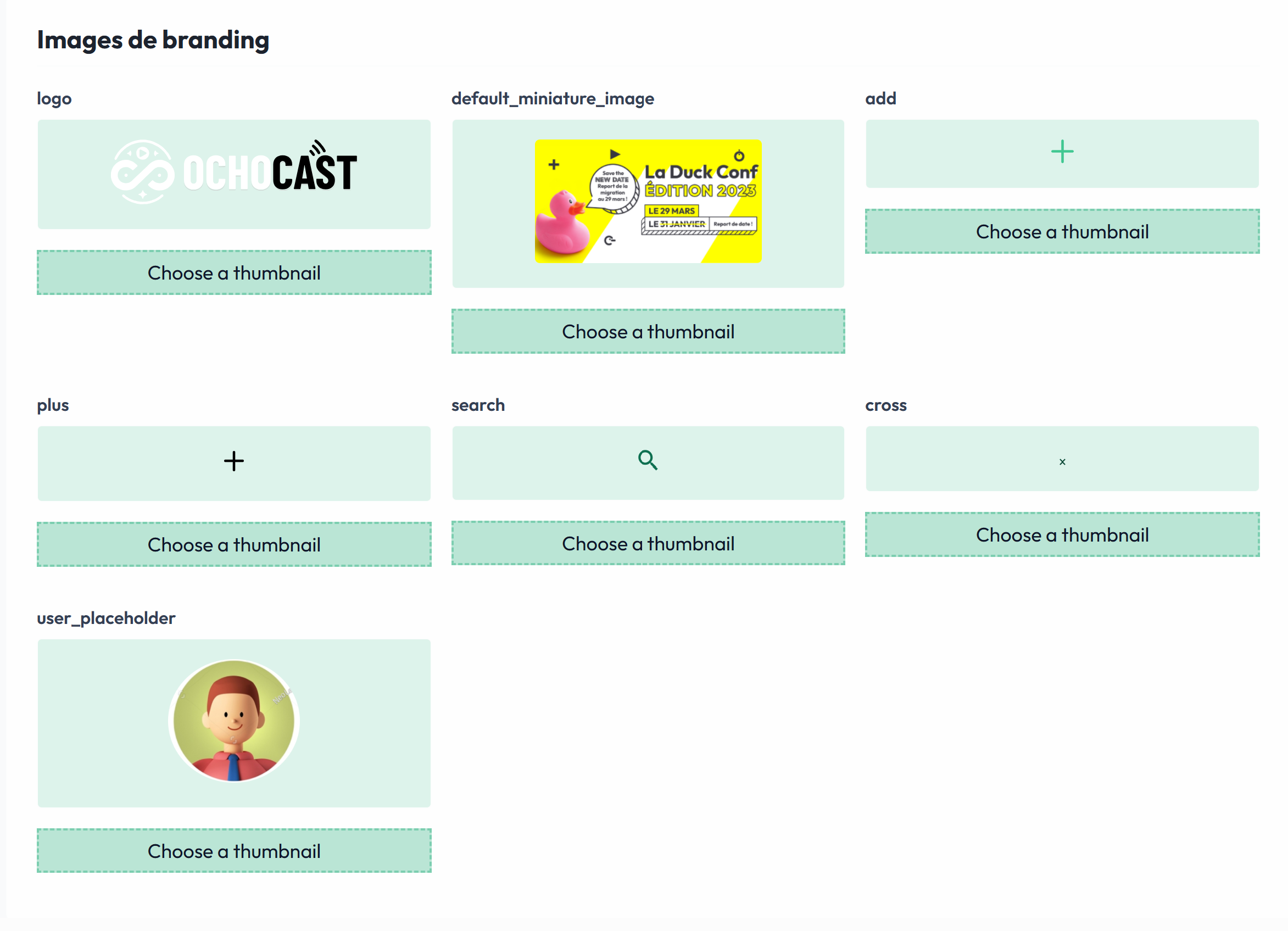
List of customizable images with previews
This section lets you customize all images used in the application.
4.1 Main logo
Field: logo
Description: Main application logo displayed in the navigation bar.
Accepted formats: SVG, PNG, JPG
Recommended dimensions:
- Width: 150–200px
- Height: 40–60px
- Format: SVG (best quality)
Visible effect:
- Displayed in the top-left of the navigation bar
- Visible on all pages
- Used as the favicon
Logo displayed in the navigation bar
How to change:
- Click “Choose file” under the current preview
- Select your new logo
- The preview updates immediately
- Click “Save configuration” to apply
4.2 Default thumbnail image
Field: default_miniature_image
Description: Image used as the default thumbnail for videos without a custom thumbnail.
Accepted formats: PNG, JPG, WEBP
Recommended dimensions:
- Width: 1280px
- Height: 720px
- Ratio: 16:9
Visible effect:
- Displayed on video cards without a thumbnail
- Used in video lists
- Visible on the home page
Usage examples:
- Newly uploaded video without a thumbnail
- Video currently being processed
- Placeholder for live events
4.3 Add icon
Field: add
Description: Icon used for add buttons.
Accepted formats: SVG (recommended), PNG
Recommended dimensions: 24×24px or 32×32px
Visible effect:
- “Add a video” button
- “Create an event” button
- Add actions in forms
4.4 Plus icon
Field: plus
Description: Plus icon used throughout the UI.
Accepted formats: SVG (recommended), PNG
Recommended dimensions: 24×24px
Visible effect:
- Expand buttons
- Quick add actions
- Dropdown menus
Add icon used in the interface
4.5 Search icon
Field: search
Description: Magnifying-glass icon for search features.
Accepted formats: SVG (recommended), PNG
Recommended dimensions: 20×20px or 24×24px
Visible effect:
- Search bar in the header
- Search fields in lists
- Search filters
Search icon in the navigation bar
4.6 Close icon
Field: cross
Description: Close (X) icon to close modals and remove elements.
Accepted formats: SVG (recommended), PNG
Recommended dimensions: 20×20px or 24×24px
Visible effect:
- Close button on modals
- Removing elements
- Canceling actions
Close icon used in modals
4.7 User placeholder image
Field: user_placeholder
Description: Default image for user profiles without a photo.
Accepted formats: PNG, JPG, SVG
Recommended dimensions:
- Width: 200px
- Height: 200px
- Format: Square
Visible effect:
- Default avatar in profiles
- Profile image in comments
- User icon in navigation
5. Saving the configuration
Save button
Label: Sauvegarder la configuration / Save Configuration
Button states:
- Active (green): Changes have been detected
- Button is clickable
- Color: theme primary color

Active save button (changes detected)
- Disabled (gray): No changes
- Button is not clickable
- Nothing to save

Disabled save button (no changes)
- In progress (gray): Saving in progress
- Label: “Sauvegarde en cours...” / “Saving in progress...”
- Button is not clickable
Save process
- Validation: check color formats
- Conversion: transform into a YAML file
- Upload: send to the server with images
- Confirmation: success or error message
- Reload: page automatically reloads after 200ms
Feedback messages
Success:
✓ Configuration updated successfully
- Green toast at the top of the screen
- Automatic page reload
Color error:
✗ Invalid color for [field_name]
- Red toast at the top of the screen
- Save is canceled
Server error:
✗ Error while updating configuration
- Red toast at the top of the screen
- Changes are not applied
6. Recommended workflow
Step 1: Planning
- Define your color palette (use tools like Coolors)
- Prepare your images with the right dimensions
- Test contrast for accessibility
Step 2: Editing colors
- Go to the admin panel (
/admin) - Change the primary color first
- Check the gradient previews
- Adjust other colors accordingly
- Make sure contrast is sufficient
Step 3: Editing images
- Upload the main logo
- Check the preview
- Upload other images if needed
- Ensure dimensions are correct
Step 4: Save and verify
- Click “Save configuration”
- Wait for the confirmation message
- The page reloads automatically
- Verify that all changes are applied
- Test navigation in the application
7. Tips and best practices
Colors
Do:
- Use colors with good contrast (minimum ratio 4.5:1)
- Test colors on different screens
- Keep consistency with your brand guidelines
- Use the full hex format (8 characters)
Avoid:
- Colors that are too light for text
- Too many different colors (stay consistent)
- Flashy colors that strain the eyes
- Forgetting transparency in the hex code
Images
Do:
- Use SVG for logos and icons (best quality)
- Optimize image size (< 500 KB)
- Follow recommended dimensions
- Use transparent backgrounds for logos
Avoid:
- Heavy images (> 2 MB)
- Poor quality or pixelation
- Unsupported formats
- Incorrect dimensions
Accessibility
- Contrast: ensure text is readable on all backgrounds
- Color blindness: test colors with color-blindness simulators
- Size: make sure icons are large enough (minimum 24×24px)
8. Troubleshooting
Save button is disabled
Cause: No changes detected
Solution: Change at least one field to enable the button
“Invalid color” message
Cause: Incorrect color format
Solution:
- Use the
#RRGGBBAAformat (8 characters) - Valid example:
#1dac78ff - Invalid example:
#1dac78(missing transparency)
Images do not display
Cause: Unsupported format or size
Solution:
- Check the format (PNG, JPG, SVG)
- Reduce size if > 2 MB
- Verify dimensions
Changes are not applied
Cause: Browser cache
Solution:
- Clear browser cache (Ctrl + Shift + R)
- Or wait for the automatic reload after saving
Error while saving
Cause: Server connection issue
Solution:
- Check your internet connection
- Verify the backend server is running
- Check server logs
- Contact the system administrator
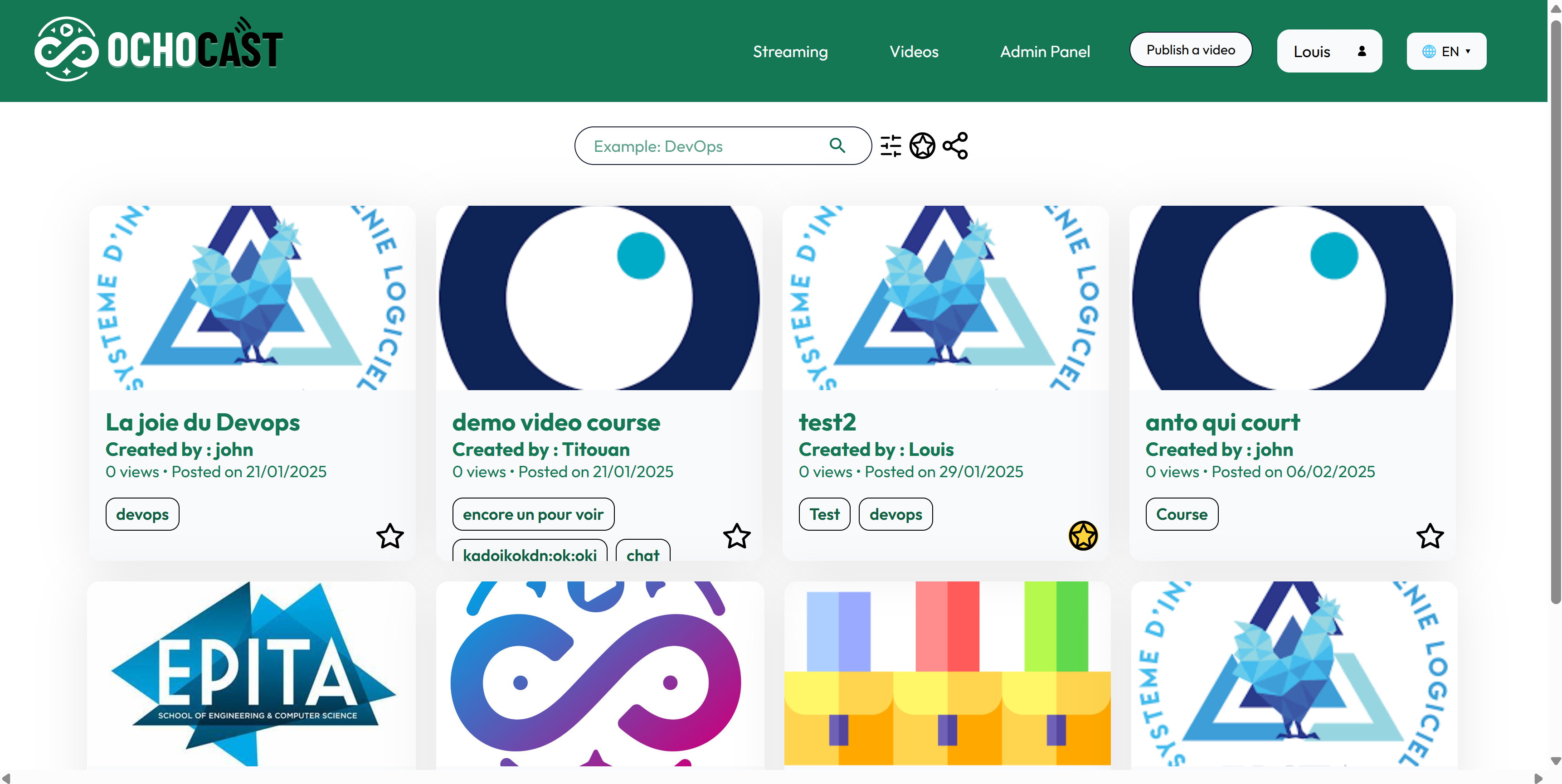
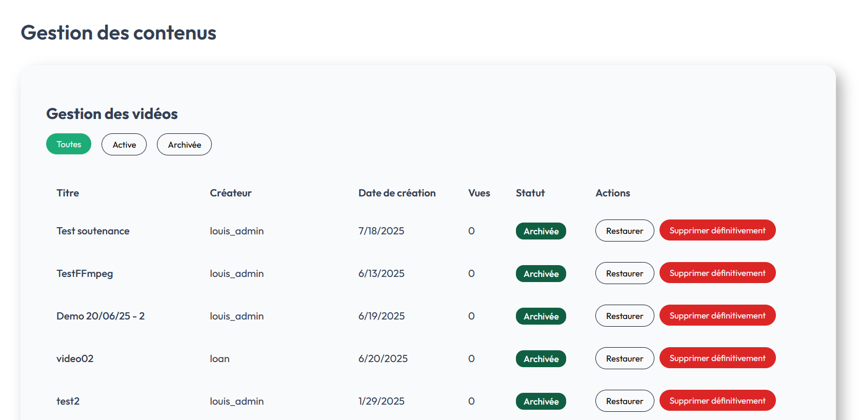
Content management
On the right side of the admin panel (see the second screen), a new Content management tab lets you manage the service’s videos: listing, archiving, restoring, and permanently deleting.
Access and permissions
- Administrators: can see all videos, including archived ones; they can restore a video (republish it) or permanently delete a video and its metadata.
- Standard users: can archive their own videos from their user space; an archived video is no longer publicly visible and is not listed for the author in public views. Non-admin users do not see archived videos globally.
Page layout
The page includes:
- Filters at the top:
All,Active,Archivedto switch between states. - A table listing videos with the columns: Title, Creator, Creation date, Views, Status, Actions.
Available actions
- Archive (user): hides the video from the public catalog and sets its status to “archived”.
- Restore (admin): republishes the video (visible in public lists) with its metadata.
- Permanently delete (admin): removes the video and its metadata from the platform — irreversible action.
Expected behavior
- When a video is archived by its author, it disappears from public lists and is not visible by default. Only administrators can later restore or permanently delete it.
- Restoring brings back the visibility and metadata as they were before archiving, provided the media files are still present in storage.
Best practices
- Verify that a backup exists before any permanent deletion.
- Log critical operations (restore, delete) for auditing.
- Notify the author before permanent deletion when possible.